In 2013 the Ministry of Justice mapped the Civil claims service to get a view of how users experienced it. It was a visual echo of the first government design principle ‘user needs not government needs’.
A service map shows the interactions that users go through from the very start of a service through to the end. Maps like this help teams understand:
- the user’s step-by-step journey
- potentially different routes users could take instead to make things easier
- if there are any gaps in the service, and why
In 2017 we service mapped over 400 DfE services. More recently we mapped 2 of our 42 school services from end to end to and from front to back to see which unnecessary steps we had to remove. These were the service for schools transferring to academies and the one that supported schools to make a significant change, like adding another class or closing a sixth form.
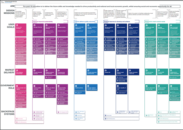
A map of service lines however is different. Service line mapping zooms out further to depict the wider ecosystem of services built up around users' needs.
Why we mapped service lines in further education
The department took over responsibility for higher and further education policy, as well as apprenticeships and wider skills policy, from the Department of Business, Innovation and Skills in 2016.
The return of this tier of education to DfE was the beginning of a new era and an opportunity to clarify what further education was trying to achieve and how it could be done. The further education service line mapping was essential.
Getting a clearer perspective on further education
As you can imagine, after the changes in responsibility for the further education system it was not as joined up as it needed to be. When services do not join up, users do not get the best experience.
In May 2019 an independent report on post-18 education and funding – also known as the Augar review – was published. It made several recommendations about the further education sector.
We wanted to get a zoomed out ‘helicopter’ view of the whole set of further education services and how they were joined. And we wanted to properly understand the impact of this join-up on users.
Service line mapping began in September 2019.
Understanding user needs, locally
The user-centred design lab led the service line mapping of 87 further education services to make sure it was intrinsically user-centred. The department wanted a fuller understanding of how some of the issues in further education played out at a local level for users.
Our users were learners and employees in further educations providers such as colleges and sixth forms, and apprenticeship training providers.
We spoke to users about how they interacted with government services to identify pain points, their needs and how government services address those needs. Then in ‘buckets’ or ‘service lines’ we grouped things logically, from our users' perspectives. This shaped our recommendations for how DfE should organise its further education end-to-end services.
The outcome of this service line mapping was the map itself plus 6 policy and service design recommendations. These informed policy colleagues working on the ‘Skills for Jobs’ white paper published earlier this year.
In our next post we’ll look at the practicalities around the user research underpinning our service line mapping.
Follow DfE Digital on Twitter.
Subscribe to our blog.
Recent Comments