The services we build in government are changed and improved (or iterated) over time. They are built and rebuilt. Team members come and go. Questions about why a service is the way it is become harder to answer. Context gets lost, research disappears and the rationale behind the design is less and less clear.
Keeping a ‘design history’ makes it easy to explain why a service is the way it is. Here we explain why and how we've written design histories for some of DfE’s services.
What is a design history
A design history is like a blog. It features posts (or updates) that describe the development of new features, iterations of existing ones, or findings from user research. It will contain anything that may be useful to return to later.
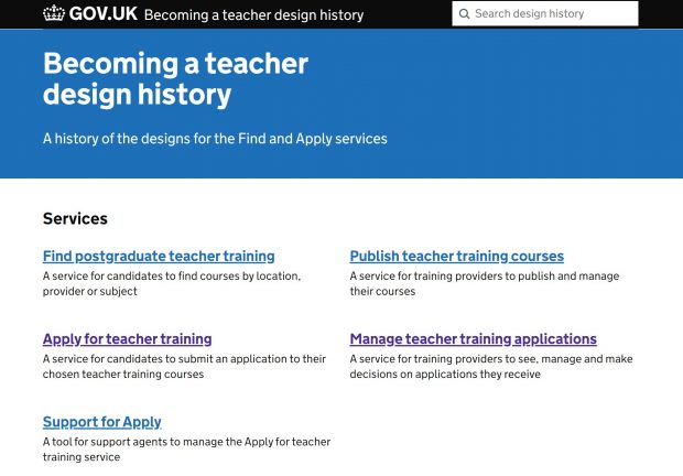
On the ‘Becoming a teacher’ team, we've been using a design history to document the evolution of the 'Find postgraduate teacher training' and 'Apply for teacher training' services since they began in May 2018.
Our design history is a public record of our designs and it tells the story of what we’ve designed and why.
How our design history began
In 2018 we were struggling to document our designs.
We started by trying to upload screenshots to Confluence, but this was not straightforward. Then we tried creating new versions of our prototypes (early stage designs), to keep the old designs on different URLs. But the designs changed too frequently for us to keep doing this.
The prototype could show us what we designed, but not why. If designs were going to be documented this had to be quick and easy and not a chore.
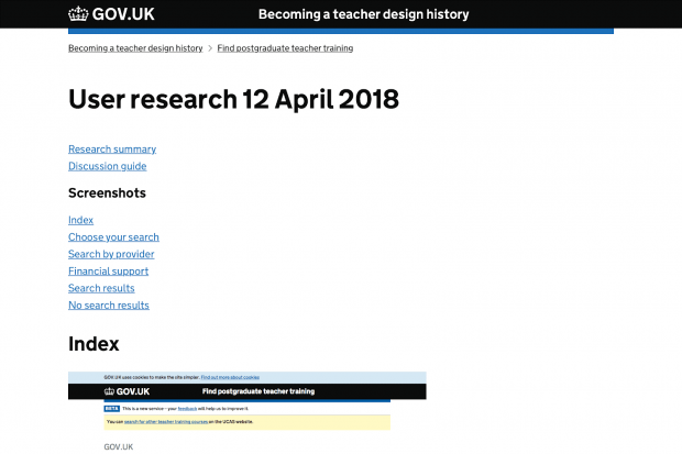
We used the GOV.UK prototype kit to make the first design history and hosted it on a platform called Heroku. The kit made it easy to create pages, and we began by making posts for each feature, showing a list of screenshots alongside descriptions of what had changed and why.
There was also a public URL for each design. The team could use this to refer to in user stories or when writing code.

When it was clear these posts were useful, we made creating them easier. We automated the process taking screenshots, saving images to the right place, and generating a page with all the HTML needed.
Now we could focus on writing about the design rather than having to record what we’re designing.
By using the GOV.UK design system for our posts we had an easy to use, readable and familiar platform for our design history. It felt right from the start.
As we researched our designs we recorded our findings with relevant screenshots. We began to link to research and video clips on Lookback (a tool for remote user research) – creating a direct link between a design and the source of a new finding.
Over time we could begin to show the old and new designs, and callout specific changes. We were recording and making our design decisions clear as we went. The design history entries began to tell our story.
Recording things that matter
As the history grew, we recorded more, for example snapshots of the service at important stages, such as at the launch of a public beta or our first publishing tool.
Sometimes the reasoning behind a particular design feature can get lost or hidden in code. Or the rationale may be obvious in certain user journeys only.
We’ve made sure that now when there are reasons and scenarios that inform a design, we capture them in the design history. This is the natural place to describe them, and it makes it easier for developers to build those features.
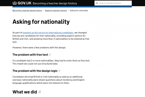
For example, in the ‘Apply for teacher training’ service we ask candidates for their nationality.

It explains:
- how candidates can record multiple nationalities
- what happens when 2 or 3 are recorded
- how the design works without JavaScript
- how we made it accessible
Occasionally we needed to print designs to show in research, to put on the wall or for group sessions. A post typically shows screenshots for a complete feature or user journey, so printing those screenshots would be ideal. We added print styles so that each post could be printed with one screenshot (and title) on a page
We also:
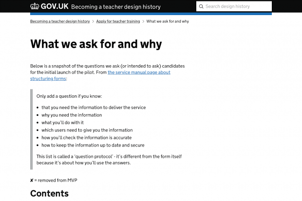
- documented the information we ask users to give us
- the emails we send users
- the processes our team followed

Making contributions easier
When the design team grew, more people needed to contribute.
To make this easier, we switched from the prototype kit to using a publishing tool called - Eleventy. This allowed designers, developers, content designers and user researchers to all contribute to the design history.
With Eleventy we added new features to make the design history easier to use, such as the search function, which is critical given the new volume of posts. There’s also:
- pagination (sequence of pages which are connected and have similar content)
- sorting of posts by date or category
- related links
As of July 2020, we’re documenting 5 services with over 200 posts.
Create your own design history
We want more teams to keep an open and public design history.
When we’re designing something new, and we’re looking to see how other service teams have solved that problem, we want to read about their designs, to evaluate them and to build on them.
We found ours incredibly useful and now we want to see other service teams benefit too. We’ve taken our design history and made it into a tool for other teams to use - a place where all the features, scripts and guides for getting started are kept.
We’ll continue to add the features we need – like ways of documenting user needs and design ideas, integration with other tools like Trello, and more. By opening up this tool to share with other teams and people outside of our organisation, we hope to see new developments and ideas.
Follow Paul on Twitter.
3 comments
Comment by Vicky posted on
This is great! I'd love to hear how you encourage regular updates and spread the load across different contributors—you mention that you moved to eleventy to make it more accessible, but it would be interesting to know who does what. In my experience it's often the interaction designer (me) who has to do the heavy lifting to document design histories so i'd love more detail about how that behaviour gets changed.
Comment by Paul Hayes posted on
Hi Vicky,
It is for the most part still the interaction designer who is documenting the designs - they know most about what has changed and why. The design history tooling takes a lot of the legwork out of the process though.
Some of our team members are familiar with Github, and can add posts directly themselves (we recently ran a Github for content designers workshop). For getting others involved, we’ve found having draft posts in Google Docs is an easy way to encourage contributions. This is how some of our content designers and user researchers have added or edited posts.
Comment by Catherine Gilhooly posted on
Excellent blog, really interested to click on the links and to learn more about your approach for documenting service design, to compare it to our approach in the apprenticeship service.