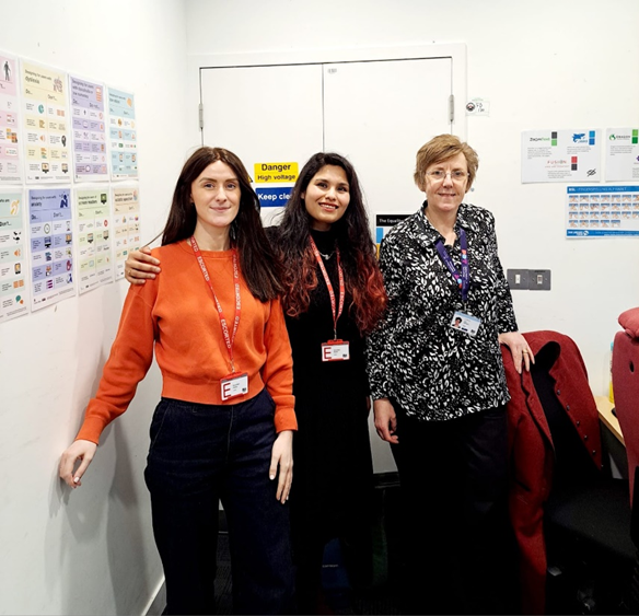
On a crisp spring morning, user researcher Sree and interaction designer Claire travelled to Sheffield to visit the Department for Education’s Accessibility Lab. Their goal was to understand how digital services function for those who navigate the world differently.
Inside the Lab: Where digital barriers become visible
We expected a technical demonstration with a run-through of tools and accessibility best practices. What we got was something much more human: a window into the lived experience of those who rely on assistive technologies daily.
Guided by Jane Dickinson, an accessibility specialist at DfE, we explored tools like Dragon, JAWS, ZoomText, and Fusion. Jane not only explained how they work but showed us how easily they can fail when services aren't built with accessibility in mind.
Insights from testing assistive tools
Dragon: Voice recognition for hands-free navigation
Dragon allows people with mobility impairments to control a computer using voice commands. Jane demonstrated how Dragon struggled with buttons on a DfE service and the BBC homepage because they weren't coded correctly. Highlighting a gap between design and code.
JAWS: Screen reader for non-visual navigation
JAWS relies on well-structured content: proper headings, labelled buttons, and descriptive links. Jane showed how unlabelled links like “Read more” or “Download” confuse JAWS users. This is due to missing descriptive ARIA labels, making browsing chaotic and frustrating.
As Jane put it:
“If a page isn’t structured properly, it’s a nightmare to navigate.”
ZoomText: For low vision users
ZoomText is a magnification tool that helps users navigate visually. However, it requires users to hover or click on links to have them read aloud, unlike JAWS, which reads automatically. At higher magnification, text can become distorted, affecting readability.
Fusion: Combining JAWS and ZoomText
Fusion provides auditory feedback and high-level magnification for individuals with partial vision loss, offering magnification up to 20x with auditory feedback. But Jane showed us that even a 3x zoom can cause layout issues, like pixelation and clipped content, especially when sites don’t reflow properly.
Keyboard-only navigation
Keyboard navigation is essential for users who can’t use a mouse, relying on shortcuts like the Alt key. But inconsistent implementation makes things harder. Jane pointed out unlabelled buttons on the BBC homepage that would leave keyboard users guessing:
“If something isn’t labelled properly, it just gets skipped over.”
Captions for hearing impairments
Captions aren’t just for deaf users, they help everyone. But live captions often lag, making comprehension harder. Testing BBC video content, we saw captions fall out of sync with speech.
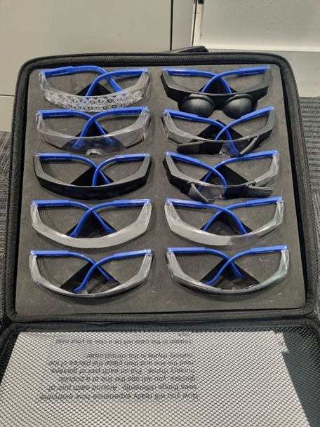
Seeing the world through the eyes of others
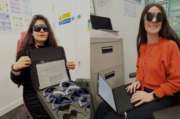
During our lab experience, we tested simulation glasses that mimic visual impairments such as cataracts (blurred vision), tunnel vision (loss of peripheral vision), and left-sided hemianopia (half the visual field disappears). It’s humbling to see how much of the digital world becomes difficult to use under these conditions. Highlighting the need for inclusive and thoughtful design.
In conversation with Accessibility Experts
To enhance our understanding of accessibility, we conducted interviews with Jane Dickinson and Jake Lloyd, two prominent accessibility specialists at the Department for Education (DfE). Jane highlighted a significant concern: the tendency to address accessibility only at the final stages of development.“It’s not enough to test for accessibility. Real users need to shape the design from the beginning.”
Jane highlighted how many users hesitate to disclose their accessibility needs for fear of being seen as difficult. Even when reports are written to improve accessibility, they often go ignored.
“I can spend a whole day writing a report, and sometimes nothing changes.”
Despite these challenges, Jane celebrated the wins,a blind user who was able to access their payslip independently for the first time:
“One of our blind users told me, ‘For the first time, I didn’t have to ask someone to read my payslip. I could do it myself.’ That made all the work worth it.”
Even small changes,like properly labelling buttons,can make a service more usable.
Jake emphasised the importance of building for keyboard navigation and screen readers from the very start.
“There are so many accessibility issues that come from not thinking about keyboard accessibility… It affects focus, visibility, and how well voice and assistive tech tools work.”
He highlighted issues like repetitive, unclear links in patterns such as “Check your answers”:
“Something like the ‘Check your answers’ pattern has links that just say ‘Change’… If you're just using a screen reader and you're navigating through a bunch of links… you're only going to hear “change”. So providing some hidden screen reader text, giving more context to that link can be really helpful.”
A holistic approach to accessibility
The accessibility specialists broke down their layered approach to testing accessibility of services:
- Automated testing to catch common issues early.
- Manual testing using only a keyboard or different zoom levels.
- Assistive tech checks like screen readers and voice controls.
- Code reviews to ensure correct HTML and component use.
As Jake put it, accessibility goes beyond the Web Content Accessibility Guidelines (WCAG) standards:
“I’ll also record issues that don’t fail WCAG but still create barriers—like having to tab 30 times to reach an ‘apply filter’ button.”
Jake warned against treating accessibility as an afterthought:
“Where teams haven't thought about accessibility and inclusive design up front and early on, complex issues tend to come out of that.”
Not boring. Not optional.
A myth Jake wants to debunk is that accessible design equals boring design.
“You can still be innovative. Your website can look good and be accessible if you plan it that way from the start,” he said. “Unfortunately, some organisations continue to treat accessibility as an afterthought, which remains a cultural issue”.
Our specialists pointed out that advocacy and awareness are key to changing this mindset:
“Having people with actual lived experience that can demonstrate the way that they interact with digital content, can be really powerful… Here's someone who is blind. They use a screen reader to navigate your service, and they can't do it.”
They stressed how one in four people have a disability—can you afford to turn them away with inaccessible services?
Why accessibility matters for everyone
Jane and Jake made it clear: accessibility isn’t just for disabled users. It benefits all of us. Captions help on a noisy train. Good contrast helps in bright light. And if zooming to 400% breaks your layout,it’s not just low vision users who suffer.
“If it’s not thought about up front, then it affects a lot of people.”
Accessibility isn’t a task—it’s a mindset
As user researchers and designers, we focus on how people interact with digital services. In Sheffield, we were learners, not experts. This experience wasn't about merely checking off accessibility guidelines. It was about understanding the impact when those guidelines are not met. Leaving Sheffield, we carried a renewed resolve to champion accessibility. The best accessibility work ensures people don't need to ask for help in the first place.
Useful resources
- Training - Accessibility manual
- Making your service accessible: an introduction - Service Manual - GOV.UK
- Accessibility and inclusive design manual - Accessibility manual
- Home | Web Accessibility Initiative (WAI) | W3C
- W3Cx: Introduction to Web Accessibility | edX
- Practical Accessibility — Practical Accessibility for web designers and developers
Recent Comments