I’d love to say the service our team is developing exists purely because we identified an unmet need, we had a clear user problem to solve, and there was no preconceived notion of what we may or may not build to address it. But things are never that simple.
Like many product managers in government, my job is to figure out how best to deliver a new or changing policy through a service so it’s useful and has value for citizens.
Sometimes our job is about picking up decisions and work that have already ‘flown’ and doing the best with what we have. But clarity of purpose is critical and one technique we’ve used recently to get this, is impact mapping.
Using impact mapping to get clarity
Right now, we’re working on a service to help new teachers learn skills and knowledge to support them at the start of their career. The content that gives new teachers the skills and knowledge they need is already a done deal to an extent. But as always, it’s a careful balance of delivering on the policy intent while helping end users get what they need. This is not a question of ‘settling in the middle’, as a colleague reminded me – compromise doesn’t help anybody.
A good starting point is to understand the desired outcome for the digital service itself – what needs to change as a result of its existence? (This is assuming a digital service needs to exist – but that’s for another day.)
There are many ways you could put content on a website, but not all of them would result in a positive and measurable impact. You might hear lots of feature ideas without understanding what the goal is.
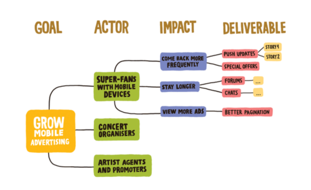
This is where impact mapping comes in. It encourages you to work backwards from a goal, clarifying:
- the people or users (sometimes called ‘actors’) that could help or hinder progress
- the impacts (or behaviour changes) that you want to encourage – or avoid – in each actor
Only when we have this clarity do we start to think about what activities or features we need to achieve the goal.
I’m not a particularly structured thinker, but this model helps guard against solution-driven thinking, and it provides a way to filter out shiny feature ideas.
It’s a visual product strategy and a great planning tool to help you make decisions.
Thinking through what matters most
But impact mapping alone doesn't give you a sense of what matters most. You can end up with a big messy diagram that makes sense, but doesn't necessarily help you plan an order of things.
To understand what matters most to our policy colleagues (our internal users) and to focus us on our own priorities, we ran a very basic stacked ranking exercise.
This helped us to see which of the behaviour changes that we'd identified would be most important in helping us reach our goal. (We weren’t thinking about features at this point.)
We asked our policy colleagues of all the behaviour changes they want to see, which did they think would be most important in helping us reach that goal? It was crude but effective. It gave us clarity about what they considered the most important behaviour changes (and kept us well clear of feature ideas).
This gave us a helpful starting point to work out as a team where we needed to focus our efforts, and how we might measure success. We now had an overall goal for the service, and 4 behaviour changes that we wanted to see. We understood what we were here to do.
Policy outcomes through the lens of user needs
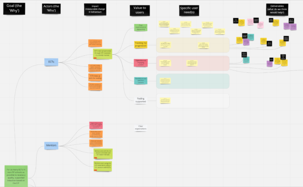
We adapted impact mapping to include 'value to users' before moving to 'deliverables'. We did this so that we could see user needs alongside the policy intent.
If we’d used a standard impact mapping technique we could quite easily have moved from desired impacts straight to activities and features, bypassing any consideration of our users’ needs, motivators or potential pain points. That would have made us sad.
Equally, if we'd developed the service based entirely on what we were learning in user research, the problems we'd be setting out to solve would look quite different. And the service would (probably) not reflect the policy at all.
Instead, we added an extra stage – value to users. Essentially, this is where the user needs are distilled into a broader theme – we do this as a team after each round of user research. These describe what our users (new teachers and their mentors) need from the service in order for it to change their behaviours.
By adapting the impact mapping tool, we were able to carve out space to delve deeper into users' needs. Exploring their motivations in more detail has meant we can align their needs with those of the business needs, and deliver the policy.
It’s a living, growing visual tool (or artefact) that serves as a starting point for conversations and creative workshops with stakeholders and the team. It’s also the basis of our roadmap and team process.
Follow Isabelle on Twitter.
Recent Comments