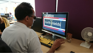
The Teaching Jobs Team have been off to Neath, Wales to see first hand the work of the Digital Accessibility Centre to help us improve and understand what it’s like for people using our service.
The analysts at the Digital Accessibility Centre test government digital services to see if they meet the government web content accessibility guidelines. We’re normally sent a report afterwards, but the team wanted to learn more about the experience for our users so we went to see the testing in person.
The team at the Digital Accessibility Centre is made up of analysts with accessibility needs such as vision impairment, dyslexia, learning difficulties, and limited mobility so that they can personally test the accessibility of web content. Using tools such as screen readers, voice control, screen magnification, and keyboard only navigation, these analysts test the service.
Seeing someone struggling to use your service with a particular accessibility tool really brings home the importance of building a truly accessible service
The team observed 5 sessions during our visit. The first session was with a user whose glaucoma leaves him with only 5% vision, in his words its similar to being in a steam room. He used particular on screen tools to help him read the website; a screen magnifier and another tool that inverts the colours, which makes it easier for him to read. Watching and talking to him, we learnt that light colours on a white background disappear when colours are inverted on a screen. This was particularly relevant to what we’re doing with the Teaching Jobs service, where we had placed important information in a grey box on a white background. We realised this couldn’t be seen by this user, and our design was making it more difficult for him to navigate the page.
Throughout the day we sat with other users with limited vision, with learning difficulties and with motor control difficulties and saw how much different design elements mattered to them. For example, when we talked to the analyst with learning difficulties, we learned that some people are unprepared for a link or button to lead to a new tab, and this can make the experience much more complicated. So, if the next page has very different formatting and colours, this could be very distracting to a user who wasn’t prepared for the change.
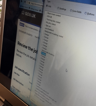
We’re aware of the different programmes that people use to navigate online, but seeing them in use really helps understand what it’s like; we saw an analyst using a type of speech recognition software called Dragon. We could hear how this software identifies buttons and links on a page to assist with navigation and on our service, the ‘Get more information’ button was being read as a link instead of a button, which can lead to confusion because each requires a different voice command. And when we observed a blind analyst testing with NVDA and JAWS (two screen readers that translate text to audio) we heard how the reader wasn’t picking up on the headings of a page - so editing a job posting was simply read out to her as “change, change, change change, change” without the context of the section headings.
We left with both the motivation and information necessary to improve the service and make it accessible to as many people as possible
So, back in the office, the team have prioritised the recommended changes. For example, our developers have changed the colour of the alert box so that it's more visible to users with vision impairments. We've also provided links to the corresponding fields when an error message comes up so that the user can easily navigate back to make a change. The change links now also have hidden descriptions that describe what is being changed when using a screen reader. We also have plans to more clearly indicate the opening of a new tab. This is important, as it prepares the user for differences in format and content and assists their overall navigation within the service.
We’re spending time thinking about this because designing accessible services benefits people with and without disabilities. Designing for digital accessibility means we don’t create barriers for our users because of bad design choices. All users benefit from clear layout and messaging, even if they don’t all use screen readers. When you design for more people, you design for more opportunities.
Recent Comments