'Apply for teacher training' is a DfE digital service in public beta, which enables aspiring teachers to find and apply for teacher training courses. We are gradually scaling up to replace the 'UCAS Teacher training' service in October 2021.
Previously we blogged about how more usability in a service brings more diversity, and we talked about the changes we made to support disabled candidates.
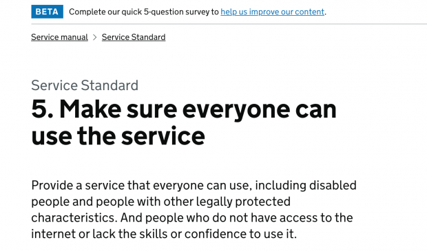
The sixth government design principle, ‘this is for everyone’, is at the centre of what we do. Accessible design is good design and if our service isn’t accessible, then it's not finished. Everything we build should be as inclusive and readable as possible.
Accessibility from the start and not at the end
In the 'Apply for teacher training' service there are lots of questions about qualifications, experience, careers and requests for references. We also ask applicants to write a personal statement about why they want to become a teacher. This can be challenging for some users.
We'd done many rounds of research over a period of 2 years. This was at different stages of the service from alpha through to public beta.
This included research with candidates who:
- have digital access needs
- lack digital skill or confidence online
- live with a disability
- have other legally protected characteristics
We also wanted to find out if candidates know how to find help when they need it. And can they continue with their journey through the service once they’d spoken to someone who’s specifically there to help them. These people are often called ‘support agents’.
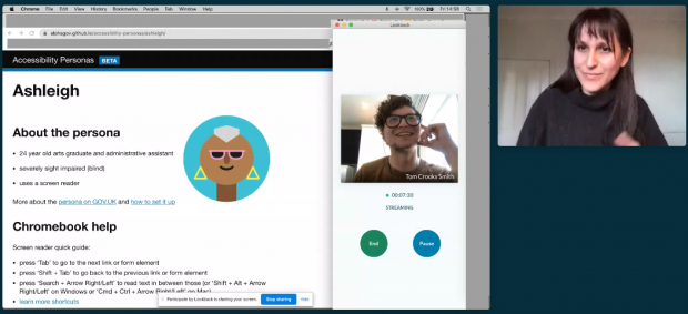
Accessibility experts in our team worked with the Disability Access Centre in Wales to continually review the service. We carried out automated accessibility testing – we do this every time we release new code or features. We run manual accessibility testing with the Disability Access Centre, and do user research with people who have access needs.
What users told us about their access needs

Using these methods we discovered needs and opportunities to make things easier for a range of users.
For example, one candidate in a low connectivity environment told us that using digital services is slow and for her full of uncertainty – she is never quite sure if the content is sent when she presses the submit button.
“You'd press send to go to the next page and then it will take ages, ages and ages, and you start to think ‘did I definitely press it?’. I live in quite a small village so it’s not like I can change [internet] providers…”
We learned from the design patterns in the GOV.UK Design system and Service manual that dividing the application form into sections and prompting users to save their answers as they go avoided this pitfall.
Another candidate we spoke to has dyslexia. His brain sometimes blocks out written words. When he has to write something like a personal statement, he does it “very slowly” and asks somebody else to read it afterwards.
“Sometimes I'll get slightly the wrong meaning. And it's because my brain hasn't processed some of the words in the paragraph.”
We knew from our research with neurodivergent candidates that we needed to divide the application form into manageable tasks that users can complete in their own time. Once again the GOV.UK task list pattern has enabled this functionality.
We also learned what kind of support candidates need at various stages of the service. This can be with the application, in the interview or on the job. So we tested how we signpost users to ways in which they can get support. We learned that users can find them.
The way in which we’ve broken down the application into sections supports users who cannot sit still or focus for long periods of time. Creating logical sections helps candidates divide up their application into manageable tasks.
Next, looking at the experience of under represented groups
In our journey to design, build and run a service that works for everyone, we are starting to look more broadly at inclusion, beyond digital accessibility.
We are now focusing on improving the outcomes of candidates from under-represented groups.
This is a broad and complex problem space, but we hope to develop recommendations – both in terms of the product and the policy – which can help us to provide an inclusive service.
We'll share our progress and the insights we uncover in this blog.
Follow DfE Digital on Twitter.
Subscribe to our blog.

Recent Comments