This is a guest post from colleagues in the Department for Transport (DfT).
We’ve recently been working on a discovery about agile. So we wanted to find out what agile means in DfE Digital and what we can learn.
More than agile
DfE Digital showed us how they communicated their vision and ways of working. We were struck that there was no mention of the word ‘agile’. We learned that sometimes it’s more helpful to talk about what that means in practice - designing for users, failing fast and iterating.
Using normal, non-digital language can be helpful when speaking to policy and delivery colleagues. This is certinaly true at DfT. We’ve been talking to policy professionals about agile principles such as understanding user needs, iterating and working in the open.
At DfE, service designers and user researchers are often embedded within policy teams. These digital professionals work side by side with policy professionals to apply user-centred design to policy making. This has worked well in other government departments too, such as MoJ and DWP.
Having senior advocates is also invaluable and colleagues at DfE are proud that their Permanent Secretary is championing user-centred design.
We learned a great deal from DfE about how agile principles could be adopted to encourage better communication, collaboration, open working and greater efficiency.
Below are some of the things we spotted which we’d like to start doing at DfT.
Walls and roadmaps are useful
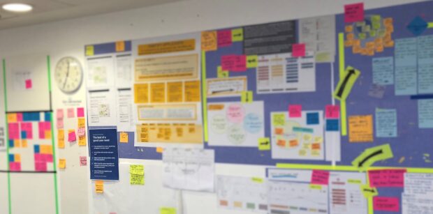
There are many benefits to having things on the wall. It makes work visible and shows what the team have achieved and where they need to get to.
One wall in particular caught our attention. This wall showed a 12 month roadmap setting out future work. We know from DfT how much people like knowing what other teams are working on and what’s coming next.
A roadmap is a great way of visualising the team’s workload and clearly setting out what the priorities are for the year ahead.
We saw research walls for a number of services showing user research plans, service maps and user journeys. (GDS encourages teams to make good use of wall space, for example using walls as ‘vertical camp fires’.)
Use different channels to communicate
In DfE Digital, good visual design is important. Professionally designed posters have helped them build credibility, especially when the team was new and needed to influence and inspire other people to work in new ways.
We saw examples of user journeys and posters to remind people of the digital delivery culture.
They've used videos to communicate with and influence other colleagues in the department. Videos with subtitles are more engaging than a slide deck or a document. At DfT, we have started to create vlogs and use live video feeds for show and tells.
Grow communities
DfE Digital has built up communities of practice across their department. These communities bring together policy makers and digital professionals at an early stage.
The team explained how they used Slack to:
- communicate accross the department
- arrange meet-ups
- coordinate lunch and learn sessions
It’s good to share
We’d like to thank DfE Digital for letting us pinch some of their ideas. If you’d like to hear more about how DfT is building our agile culture and being user-centred, you can read our blog.

1 comment
Comment by Jenny Mulholland posted on
Thanks for sharing these great ideas with everyone else, too!